


Accessible Web Design: A Practical Guide for WordPress and Shopify Sites
Approximately 350 million people have colour-vision deficiency. Missing focus indicators and ARIA attributes are among the most common accessibility failures on WordPress and Shopify sites. Learn the code-level practices that win both search and user trust.
Implementation-focused guidance for WordPress and Shopify developers

7 min read

Photo by sarah b on Unsplash
TL;DR: Around 350 million people worldwide have colour-vision deficiency, and a missing or invisible keyboard focus indicator is one of the most common accessibility failures on WordPress and Shopify sites. Accessibility web design is the practice of building sites that everyone can perceive, operate and understand — communicating status clearly, recovering gracefully from errors, and never depending on a single sensory channel. This guide covers the code-level specifics that matter most: focus states, colour redundancy, ARIA-driven form validation and respectful motion.
This is the practical companion to our website accessibility guide — where that pillar sets out the principles, this post gets into the code. If you maintain a WordPress or Shopify site, most accessibility wins are small, specific and entirely within your control. Here is what they look like in practice.
What Does Accessibility Web Design Actually Mean?
Accessibility web design means building interfaces that work for the full range of human ability — people using a keyboard instead of a mouse, a screen reader instead of a screen, or simply browsing on a small phone in bright sunlight. The Web Content Accessibility Guidelines (WCAG) 2.2 set the benchmark, but the underlying aim is simpler than the spec suggests.
Every interface should communicate its status clearly, recover gracefully from errors, and respect the diversity of its users’ abilities and preferences. That principle runs through everything below.
For UK small businesses this is also a commercial decision. An accessible site reaches more customers, reduces legal risk and tends to perform better in search — the same clear structure that helps a screen reader helps Google too. Compliance is the floor, not the ceiling; the real prize is a better experience for everyone.
Focus States & Keyboard Navigation (The Most Common Failure)
Removing the browser’s default :focus outline without providing a custom replacement is one of the most common accessibility failures on both WordPress and Shopify sites (shopify.dev). Anyone navigating by keyboard relies on that outline to know where they are — strip it away and the page becomes unusable for them.
A visible focus indicator is a WCAG 2.2 requirement, and it must have a minimum 3:1 contrast ratio against adjacent colours (shopify.dev). The fix is not to keep the faint default browser outline, but to replace it with something deliberate:
/* Don't do this without a replacement */
:focus { outline: none; }
/* Provide a clearly visible custom focus style instead */
:focus-visible {
outline: 3px solid #1d70b8;
outline-offset: 2px;}
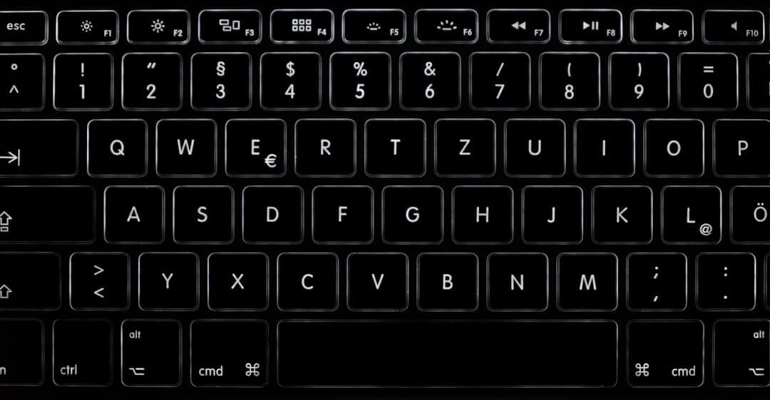
Photo by Alexander Sinn on Unsplash
Test it yourself: put the mouse aside and tab through your site. Every link, button and form field should show an obvious, high-contrast outline in a logical order. If the focus disappears or jumps around, you have found your first job.
Colour, Contrast & Redundant Cues (350 Million Users)
Approximately 350 million people worldwide have colour-vision deficiency (nngroup.com). For them, an error shown only in red is invisible — which is exactly why using colour alone to convey meaning violates WCAG 1.4.1.
The rule is simple: never rely on a single channel. Every error, status or interactive change should carry at least two cues — colour plus an icon, colour plus text, or colour plus a border-weight change (nngroup.com). A red border becomes a red border with a warning icon and a plain-English message.

Photo by Brett Jordan on Unsplash
This matters most where WordPress and Shopify sites tend to fall down in practice: form validation. Out of the box, many themes flag an invalid field with nothing more than a colour change. Add text and an icon and the message reaches everyone. Body text must also meet a minimum 4.5:1 contrast ratio against its background (WCAG 1.4.3 AA), or 3:1 for large text (w3.org).
ARIA Attributes & Form Validation
Visual cues only help people who can see them. For screen-reader users, accessible forms depend on the right ARIA attributes wiring each error to its field.
GOV.UK‘s three-step error pattern is the gold standard (design-system.service.gov.uk): prepend “Error:” to the page title so screen readers announce it immediately; show an error summary at the top of the page with role="alert" and move keyboard focus to it; then show a message next to each invalid field using the same wording. Each summary item links to its field.
At field level, associate every error message with its input using aria-describedby, and set aria-invalid="true" — but only after validation has run, never before the user has interacted with the field (w3.org).
<label for="email">Email address</label>
<input
id="email"
type="email"
aria-invalid="true"
aria-describedby="email-error">
<p id="email-error" class="error">
Error: Enter your email address in the format name@example.com</p>
For dynamic feedback, use aria-live="polite" so the screen reader finishes its current announcement before reading the error, and make sure the live-region container already exists in the DOM on page load (w3.org). Shopify’s Dawn theme and many WordPress form plugins ship without these associations (testparty.ai). On WordPress, Gravity Forms (with legacy markup disabled) and Formidable Forms produce accessible markup; for WPForms, enable “Modern Markup” in the general settings (gravityforms.com).
Motion & prefers-reduced-motion (WCAG 2.3.3)
Animation can do real harm. Parallax scrolling and auto-playing carousels without pause controls can trigger vestibular disorders in susceptible users (smashingmagazine.com). WCAG 2.3.3 requires that motion triggered by interaction can be disabled, unless the animation is essential (w3.org).
The right approach is progressive enhancement: define static styles by default and add motion only inside a prefers-reduced-motion query (w3.org).
/* Static by default; add motion only when the user allows it */
@media (prefers-reduced-motion: no-preference) {
.card {
transition: transform 200ms cubic-bezier(0.2, 0, 0, 1);
}}
Reduced motion does not mean no motion — replace problematic effects with subtle alternatives such as opacity fades (smashingmagazine.com). Keep transitions short, too: 150–200ms feels responsive on desktop, while anything beyond 400ms feels sluggish (m1.material.io). Many WordPress themes ship animated sections that ignore the media query entirely, so audit yours component by component.
Practical Next Steps for Your Site
You can make real progress this week:
- Audit first. Combine automated and manual checks — browser DevTools, WAVE and Lighthouse, supplemented by keyboard and screen-reader testing (shopify.dev). Automated tools catch only some issues; tabbing through your own pages catches the rest.
- WordPress: install the WP Accessibility plugin, which adds missing labels, removes problematic
tabindexvalues and pauses autoplay when reduced motion is set (wordpress.org). Run the Equalize Digital Accessibility Checker for ongoing monitoring (equalizedigital.com). - Shopify: run
shopify theme checkfrom the CLI and add Shopify’s Lighthouse CI Action to catch regressions before they ship (shopify.dev). - Choose forms carefully. Gravity Forms produces accessible markup by default; with WPForms, switch on Modern Markup mode (gravityforms.com).

Photo by Glenn Carstens-Peters on Unsplash
Accessibility web design rewards steady, specific work far more than a single big push. Fix your focus states, add redundant cues, wire up ARIA and respect motion preferences — and you’ll be well on your way to full WCAG compliance, building a site that more people can use and that search engines understand better.
Ready to audit your site? Our team can help you meet WCAG 2.2. Get in touch.
Related articles
What do web designers actually do? A plain-English guide for UK small businesses
What does a web designer actually do — and how can you tell a good one from a bad one? This plain-English guide breaks down the evidence-based decisions behind every page of your website, from homepage layout to Core Web Vitals.

Web design for small business: the complete guide for UK SMEs
Small business web design is often oversold on trends and undersold on fundamentals. This guide breaks down what actually drives customer action: responsive layouts, Core Web Vitals, WCAG accessibility, and cost discipline—with practical checklists for WordPress, Shopify, and site evaluations.
How to choose a Shopify agency: what UK businesses should ask before hiring
Hiring the right Shopify agency can transform your e-commerce store — but choosing the wrong one can be costly. Discover the key questions to ask, red flags to watch, and how to evaluate a Shopify expert’s credentials.
Ready to grow your business online?
Let's build a website that works as hard as you do.
Mon–Fri, 9am–5pm
— or —
Free 30‑minute consultation
24-hour response guarantee
We'll get back to you within one business day, every time.
No hard sell, ever
Just an honest conversation about whether we're the right fit.
Talk to the people who'll do the work
No account managers or middlemen. Meet your actual team.